If you’re looking for an alternative to factor analysis for processing employee survey data, consider using psychometric network analysis (hereafter PNA).
- It provides insight into the interdependencies between different topics related to employee experience, and the resulting network diagrams make these insights easily accessible even to non-experts.
- It helps to identify key topics (nodes) that have the most connections or influence within the network, which can be valuable for identifying areas of focus.
- Although PNA doesn’t work with latent factors, common community detection algorithms (e.g., Louvain’s method) can be used to identify clusters of more densely interconnected topics.
- In interpreting the PNA outputs, one can rely on the apparatus of bootstrapping statistics to distinguish signal from noise.
What follows is a small demonstration of the use of PNA on employee survey data. For this purpose, I used a sample dataset that accompanies the book Predictive HR Analytics: Mastering the HR Metric by Edwards & Edwards (2019). It contains the survey responses of 832 employees on a 1 ‘strongly disagree’ to 5 ‘strongly agree’ response scale for a following set of statements.
# uploading libraries
library(readxl)
library(DT)
library(tidyverse)

# uploading legend to the data
legend <- readxl::read_excel("./surveyResults.xls", sheet = "Legend")

# user-friendly table with individual survey items
DT::datatable(
  legend %>% dplyr::mutate(Scale = as.factor(Scale)),
  class = 'cell-border stripe',
  filter = 'top',
  extensions = 'Buttons',
  fillContainer = FALSE,
  rownames= FALSE,
  options = list(
    pageLength = 5,
    autoWidth = TRUE,
    dom = 'Bfrtip',
    buttons = c('copy'),
    scrollX = TRUE,
    selection="multiple"
  )
)
And here is a table with the survey responses we will analyse.
# uploading data
data <- readxl::read_excel("./surveyResults.xls", sheet = "Data")

# selecting relevant data
mydata <- data %>%
  dplyr::select(ManMot1:pos3)

# user-friendly table with the data used in the analysis
DT::datatable(
  mydata,
  class = 'cell-border stripe',
  filter = 'top',
  extensions = 'Buttons',
  fillContainer = FALSE,
  rownames= FALSE,
  options = list(
    pageLength = 5,
    autoWidth = TRUE,
    dom = 'Bfrtip',
    buttons = c('copy'),
    scrollX = TRUE,
    selection="multiple"
  )
)
We will use the bootnet R package to estimate the regularized partial correlation network using the Spearman correlation matrix and LASSO regularization, and then select the final network using the Extended Bayesian Information Criterion (with γ parameter set to 0.5).
# estimating a regularized partial correlation network
network <- bootnet::estimateNetwork(
  mydata,
  default = "EBICglasso",
  corMethod = "spearman",
  threshold = FALSE # when TRUE, enforces higher specificity, at the cost of sensitivity
)

print(network)
The above brief summary of the estimated network shows that it is a relatively dense network with 158 out of 406 possible connections (39%). Now let’s plot the network.
# plotting the estimated network
plot(
  network,
  layout = "spring",
  groups = legend %>% dplyr::pull(Scale),
  nodeNames = names(mydata),
  weighted = TRUE,
  directed = FALSE,
  label.cex = 0.7,
  label.color = 'black',
  label.prop = 0.9,
  negDashed = TRUE,
  legend.cex = 0.27,
  legend.mode = 'style2',
  font = 2,
  theme = "classic"
)
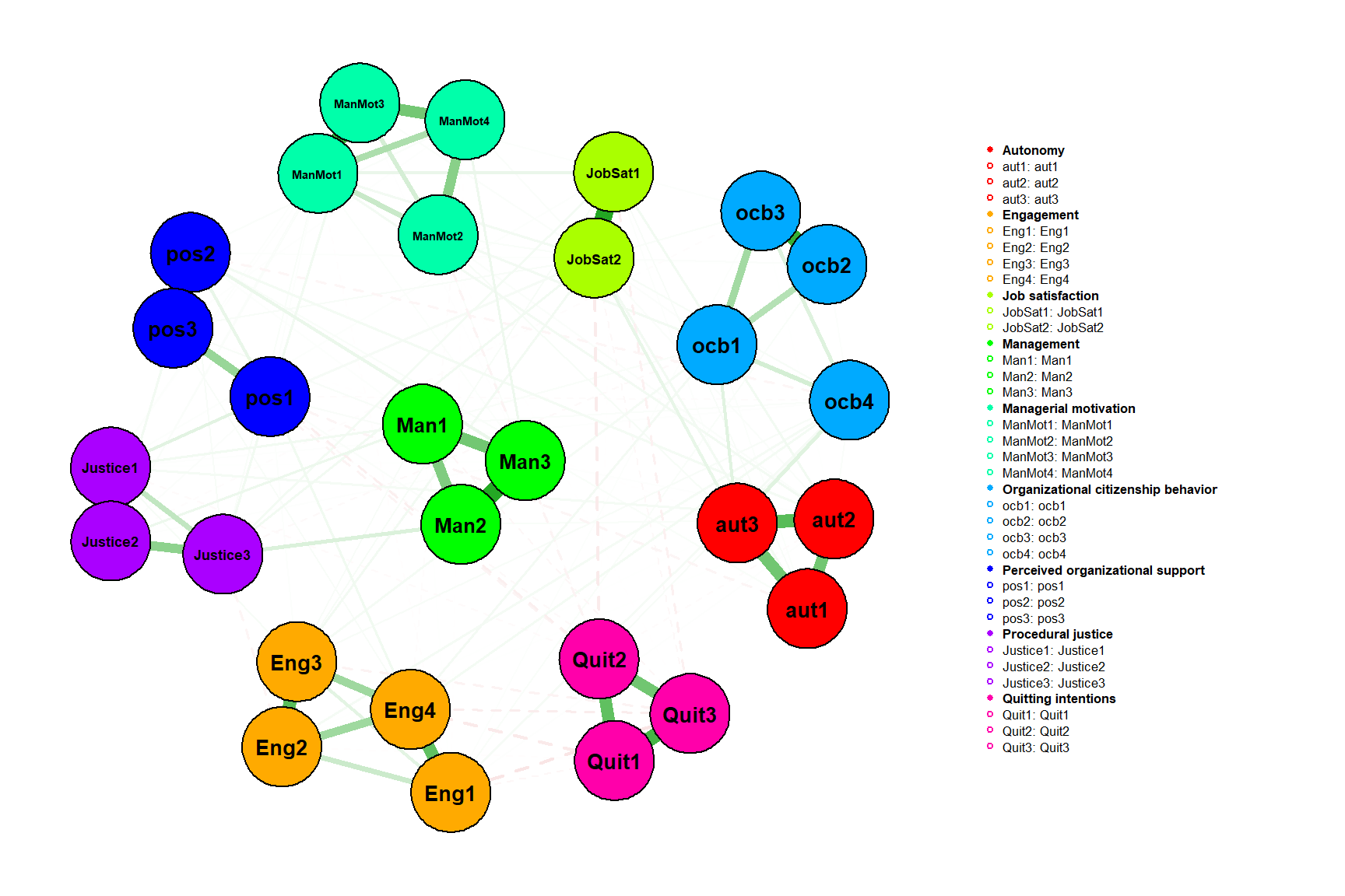
We can also plot the network in ggplot style, which can be useful when we need more control over the chart, e.g. when we want to plot identified communities/clusters instead of theoretical scales. To do this, we just need to get the necessary information from the network object and do a few data manipulations.
# uploading
library(igraph)
library(ggraph)

# extracting information about the connections form the network object
ngMatrix <- network$graph
# inputting to upper part of the matrix zeroes (the edges between items are symmetrical, so we need just a half of the matrix)
ngMatrix[upper.tri(ngMatrix)] <- 0

# transforming matrix into dataframe
ngDf <- ngMatrix %>%
  as.data.frame() %>%
  tibble::rownames_to_column() %>%
  dplyr::rename(itemID = rowname)

# creating a dataframe with information about connections between items
fromToList <- data.frame()

for(i in unique(ngDf$itemID)){

  suppDf <- ngDf %>%
    dplyr::filter(itemID == i) %>%
    tidyr::pivot_longer(-itemID, names_to = "to", values_to = "weight") %>%
    dplyr::filter(weight != 0) %>%
    dplyr::rename(from = itemID) %>%
    dplyr::mutate(
      sign = case_when(
        weight < 0 ~ "negative",
        weight > 0 ~ "positive",
        TRUE ~ "zero"
      ),
      weight = abs(weight)
    )

  fromToList <- dplyr::bind_rows(fromToList, suppDf)

}


# creating a dataframe with information about individual items
items <- data.frame(
  item = names(mydata),
  scale = legend %>% pull(Scale)
)

# creating igraph object
igraph_graph <- igraph::graph_from_data_frame(fromToList, directed=FALSE, vertices = items)

# visualizing the network
set.seed(123)
ggraph::ggraph(igraph_graph, layout = "fr", maxiter = 500) +  # fr, kk, drl, mds, maxiter = 500 is default
  ggraph::geom_edge_link(aes(edge_width = weight, color = sign), alpha = 0.05) +
  ggraph::geom_node_point(aes(color = scale), size = 5) +
  ggraph::geom_node_text(aes(label = name), repel = TRUE, size = 3) +
  ggraph::theme_graph(background = "white") +
  ggraph::scale_edge_color_manual(values = c("negative" = "red", "positive" = "blue")) +
  ggplot2::scale_color_brewer(palette="Set1")
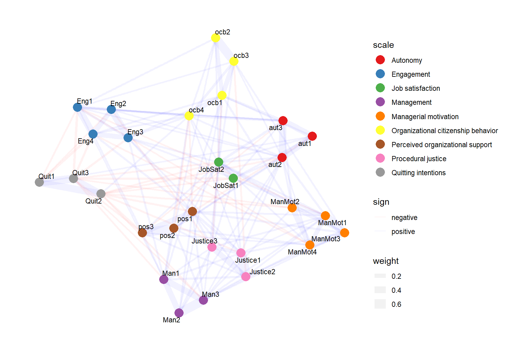
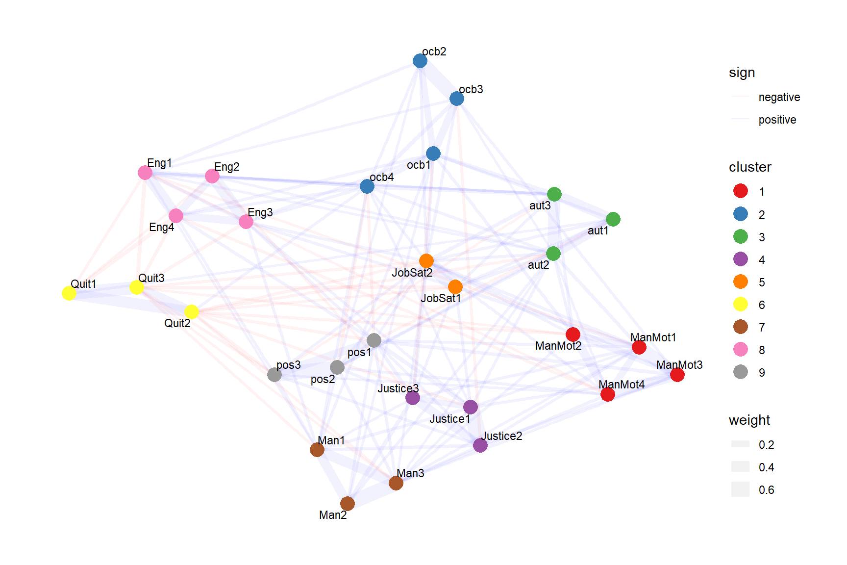
From the charts we can quickly gain a basic idea of the internal structure of the data. For example, we can notice that:
- items from the same scales tend to cluster close to each other;
- there are items from different scales that appear to measure motivational aspects of employee attitudes (engagement, organizational citizenship behavior, and quitting intentions), and satisfaction with the “external forces” that affect employee experience (management, justice, and perceived organizational support);
- the topic of autonomy is closely related to the topic of managerial motivation;
- most of the negative partial correlations are between items measuring quitting intentions and other survey items.
To identify most influential topics (nodes) within the network, we can use centrality measures that quantify the relative importance of a node within a network based on different aspects of a node’s role in the network.
# uploading library
library(qgraph)

# computing centrality measures for individual survey items
qgraph::centralityPlot(network, include = "all", orderBy = "ExpectedInfluence")
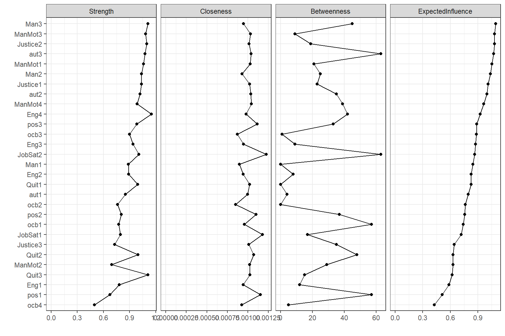 Based on the expected influence centrality measure, which takes into account the presence of both negative and positive edges, the following items appear to be among the most influential ones:
- Man3:
r legend %>% dplyr::filter(Item == "Man3") %>% dplyr::pull(Text) - ManMot3:
r legend %>% dplyr::filter(Item == "ManMot3") %>% dplyr::pull(Text) - Justice2:
r legend %>% dplyr::filter(Item == "Justice2") %>% dplyr::pull(Text) - aut3:
r legend %>% dplyr::filter(Item == "aut3") %>% dplyr::pull(Text) - ManMot1:
r legend %>% dplyr::filter(Item == "ManMot1") %>% dplyr::pull(Text)
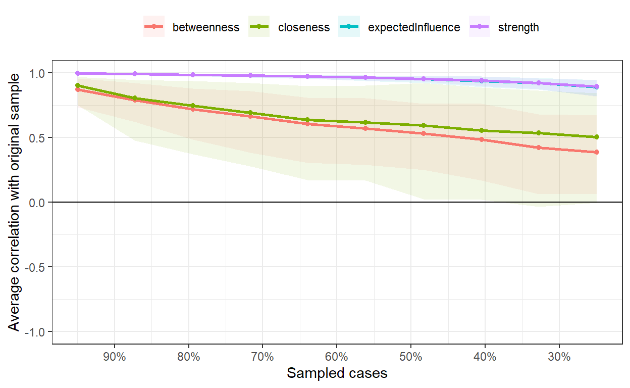
But to know how much we can rely on these measures, we must first test their stability using correlation stability analysis that repeatedly computes centrality indices of subsets of the data and correlates these with the centrality indices of the full data. This process generates a correlation stability coefficient (CS-Coefficient) for each centrality measure. The CS-Coefficient corresponds to the proportion of cases that can be dropped while retaining with 95% certainty a certain level of correlation (e.g., 0.7) between the original centrality measure and the centrality measure of the subset. The higher the CS-Coefficient, the more robust the centrality measure is to the reduction of cases. According to Epskamp & Fried (2018), the CS-coefficient should be above 0.5, and should be at least above 0.25. In our case, we can see the that we can make solid interpretations based on centrality measures of strength (CS(cor = 0.7) = 0.75) and expected influence (CS(cor = 0.7) = 0.75).
# estimating the stability of centrality measures
bootnet_case_dropping <- bootnet::bootnet(
  network,
  nBoots = 2500,
  type = "case",
  nCores = 6,
  statistics = c('strength', 'expectedInfluence', 'betweenness', 'closeness')
)

# plotting the results
plot(bootnet_case_dropping, 'all')

# listing the results
bootnet::corStability(bootnet_case_dropping)
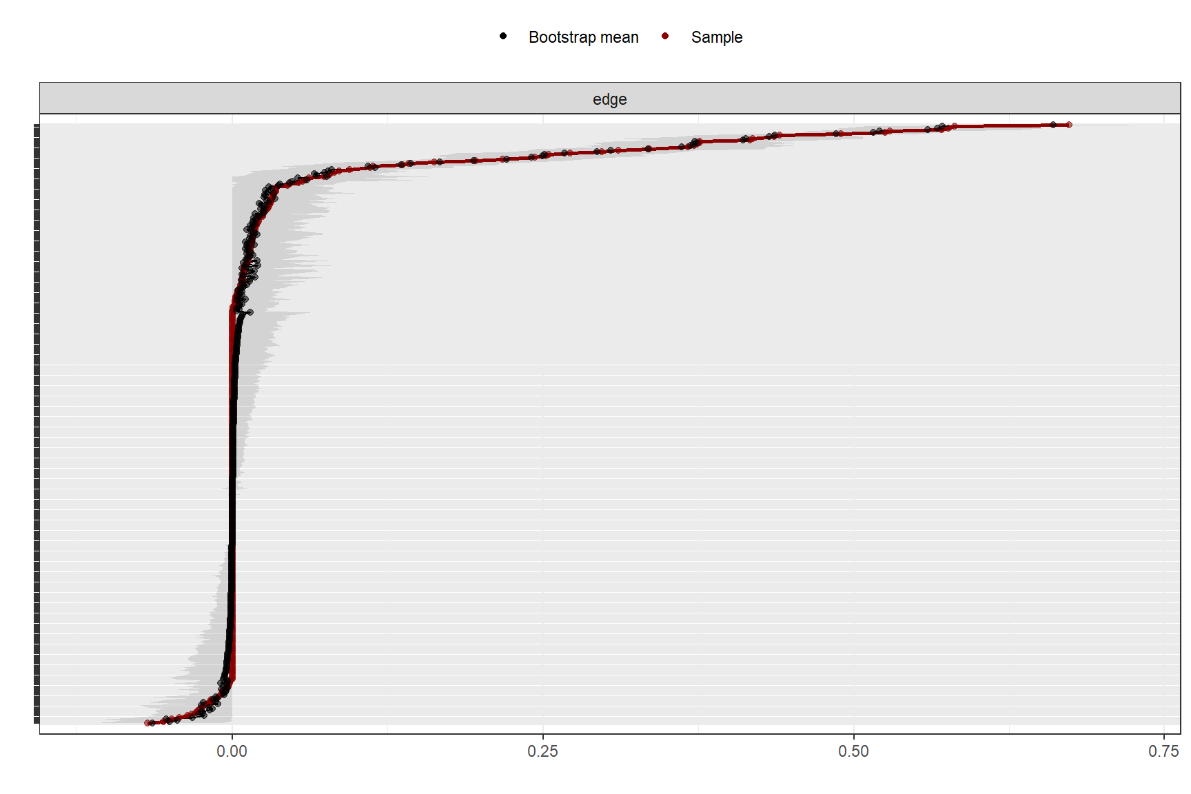
In a similar way, i.e. using a bootstrapping, we can estimate the stability of the edge weights. This gives us information on how much the edge weights for individual connections vary with 95% confidence intervals. From the chart below, it’s apparent that some edge weights are more accurate than others, as they show a narrower band. Simultaneously, we observe that the majority of edges closer to zero appear to be non-significant, as they intersect with zero in the bootstrapped samples.
# estimating the stability of edge weights
bootnet_nonpar <- bootnet::bootnet(
  network,
  nBoots = 1000,
  nCores = 6
  )

# plotting the results
plot(bootnet_nonpar, labels = FALSE, order = "sample")
To find internal structure in the estimated network, we need not rely solely on the visual inspection of the network diagram, but we can use some of the common community detection algorithms that can be used to identify clusters of more densely connected topics. In the example below, we have merely ” replicated” an existing clustering by scale, which is an indication that the authors have managed to construct a survey that measures distinct constructs that they originally intended to measure, but in practice you are likely to observe less distinct patterns more often, which can give you clues about how to improve the construction of the employee survey.
# identifying communities/clusters
clu <- igraph::cluster_louvain(igraph_graph, weights = fromToList$weight) # cluster_optimal, cluster_louvain, cluster_leading_eigen, cluster_fast_greedy, cluster_walktrap,   cluster_edge_betweenness, cluster_spinglass

# assigning communities/clusters to nodes
member <- membership(clu)
V(igraph_graph)$cluster <- as.character(member)

# visualizing the network with identified communities/clusters
set.seed(123)
ggraph::ggraph(igraph_graph, layout = "fr", maxiter = 500) +  # fr, kk, drl, mds, maxiter = 500 is default
  ggraph::geom_edge_link(aes(edge_width = weight, color = sign), alpha = 0.05) +
  ggraph::geom_node_point(aes(color = cluster), size = 5) +
  ggraph::geom_node_text(aes(label = name), repel = TRUE, size = 3) +
  ggraph::theme_graph(background = "white") +
  ggraph::scale_edge_color_manual(values = c("negative" = "red", "positive" = "blue")) +
  ggplot2::scale_color_brewer(palette="Set1")
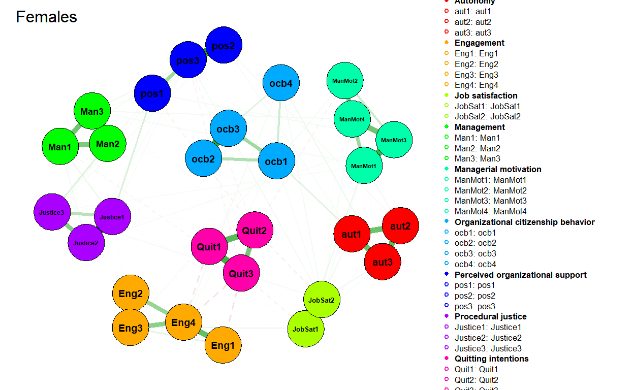
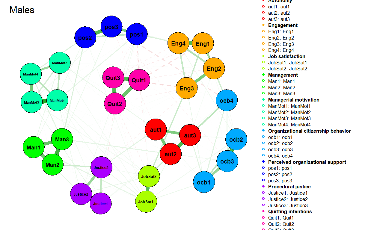
Another use case would be to test for differences in job attitudes’ connectivity and centrality across different groups of employees. To do this, we can use the NetworkComparisonTest R package that implements permutation based hypothesis testing of differences between two networks. Let’s illustrate it with differences between networks estimated on data coming from females and males. We first filter data for both genders and than estimate and visualize their respective attitudinal networks.
# filtering data for females and males
mydataFemale <- data %>%
  dplyr::filter(sex == 2) %>%
  dplyr::select(ManMot1:pos3)

mydataMale <- data %>%
  dplyr::filter(sex == 1) %>%
  dplyr::select(ManMot1:pos3)

# estimating a regularized partial correlation network for females and males
networkFemale <- bootnet::estimateNetwork(
  mydataFemale,
  default = "EBICglasso",
  corMethod = "spearman",
  threshold = FALSE
)

networkMale <- bootnet::estimateNetwork(
  mydataMale,
  default = "EBICglasso",
  corMethod = "spearman",
  threshold = FALSE
)

# plotting the estimated networks
plot(
  networkFemale,
  layout = "spring",
  groups = legend %>% dplyr::pull(Scale),
  nodeNames = names(mydataFemale),
  weighted = TRUE,
  directed = FALSE,
  label.cex = 0.7,
  label.color = 'black',
  label.prop = 0.9,
  negDashed = TRUE,
  legend.cex = 0.27,
  legend.mode = 'style2',
  font = 2,
  theme = "classic",
  title = "Females"
)

plot(
  networkMale,
  layout = "spring",
  groups = legend %>% dplyr::pull(Scale),
  nodeNames = names(mydataMale),
  weighted = TRUE,
  directed = FALSE,
  label.cex = 0.7,
  label.color = 'black',
  label.prop = 0.9,
  negDashed = TRUE,
  legend.cex = 0.27,
  legend.mode = 'style2',
  font = 2,
  theme = "classic",
  title = "Males"
)
We can check four basic types of differences between the networks:
- The maximum difference in edge weights (M statistic) that tells us whether the structure of the network is identical across two compared groups, and thus whether the groups differ in the overall “shape” or “architecture” of their attitudes.
- The difference in global strength (S statistic) that tells us whether the density of the network is identical across the groups, and thus whether they differ in their openness to change of their attitudes and behaviors (see, for example, Zwicker et al. (2020)).
- The difference in the centrality measures across the groups that tell us whether the groups differ in topics that are most important/influential in their attitudinal network.
- The difference between groups in specific edges. According to van Borkulo et al. (2017), when the M statistic is not statistically significant, it is recommended not to test group-level differences for specific edges as it increases the likelihood of Type 1 error.
As you can see below, (almost) all test results are statistically non-significant, so we don’t have sufficiently strong evidence for claiming that there are substantive differences between females and males in their respective attitudinal networks. Only in the case of the Eng1 item (I share the values of this organization.), females show a statistically significantly smaller strength centrality measure compared to males. Given that M statistic is statistically non-significant, we don’t test statistical significance of differences for specific edges.
# uploading library
library(NetworkComparisonTest)

# testing the differences
set.seed(123)
testGenderDiff <- NetworkComparisonTest::NCT(
  networkFemale,
  networkMale,
  binary.data=FALSE,
  paired=FALSE,
  weighted=TRUE,
  test.edges=FALSE,
  edges="all",
  p.adjust.methods="holm",
  test.centrality=TRUE,
  centrality=c("strength","expectedInfluence"),
  nodes="all",
  progressbar=FALSE
  )

# printing test results
print(testGenderDiff)

# checking observed differences in centrality measures
# testGenderDiff$diffcen.real

# plotting results of the network structure invariance test
# plot(testGenderDiff,what="network")
# plotting results of global strength invariance test
# plot(testGenderDiff,what="strength")
# plotting results of the edge invariance test
# plot(testGenderDiff,what="edge")
I hope you find this post useful and that it inspires you to try PNA on your own data. If you were looking for more authoritative sources on PNA, Epskamp & Fried’s (2018) tutorial is a good place to start. An excellent introduction to the topic can also be found in Letouche & Wille (2022) and Dalege et al. (2017), respectively.
Figures
Related notes
- Induced centralities
- Using network graph modeling to capture overarching thematic clusters in employee comments
- RWA – A go-to tool for key drivers analysis of employee survey data?
- Latent Class Analysis of responses from employee surveys
- Visual statistical inference
📄 Read the original post with full outputs on my blog.