The turn of the year, which is full of all sorts of resolutions to change for the better in our private lives and in our organizations, is a good time to remind ourselves that analytic tools can be very helpful in our efforts to make these resolutions come true. One way they can help us is by verifying that we have really achieved our stated goals and that we are not just fooling ourselves into believing so. We need to keep in mind Richard Feynman’s famous principle of critical thinking…
One of the tools that can help us with that is segmented regression analysis of interrupted time series data (thanks to Masatake Hirono for pointing me to its existence). It allows us to model changes in various processes and outcomes that follow interventions, while controlling for other types of changes (e.g. trends and seasonality) that may have occurred regardless of the interventions. It is thus very useful for data analysis conducted within studies with a quasi experimental study design that are often in the organizational context the best alternative to the “gold standard” of randomized controlled trials (RCTs) that are not always realizable or politically acceptable.
Search interest in work-life balance and well-being
For illustration, let’s use this tool for testing hypothesis about people’s increased interest in topics related to work-life balance and well-being due to the COVID-19 pandemic and subsequent changes in the way people work. As a proxy measure of this interest we will use worldwide search interest data over the last 10 years from Google Trends using search terms work-life balance and well-being (see Fig. 1 and 2 below).
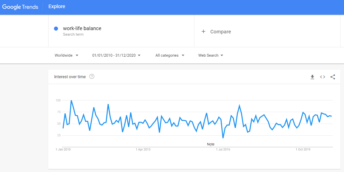 Fig. 1: Interest in “work-life balance” topic over the last 10 years measured as a search interest by Google Trends. The numbers represent search interest relative to the highest point on the chart for the given region and time. A value of 100 is the peak popularity for the term. A value of 50 means that the term is half as popular. A score of 0 means that there was not enough data for this term.
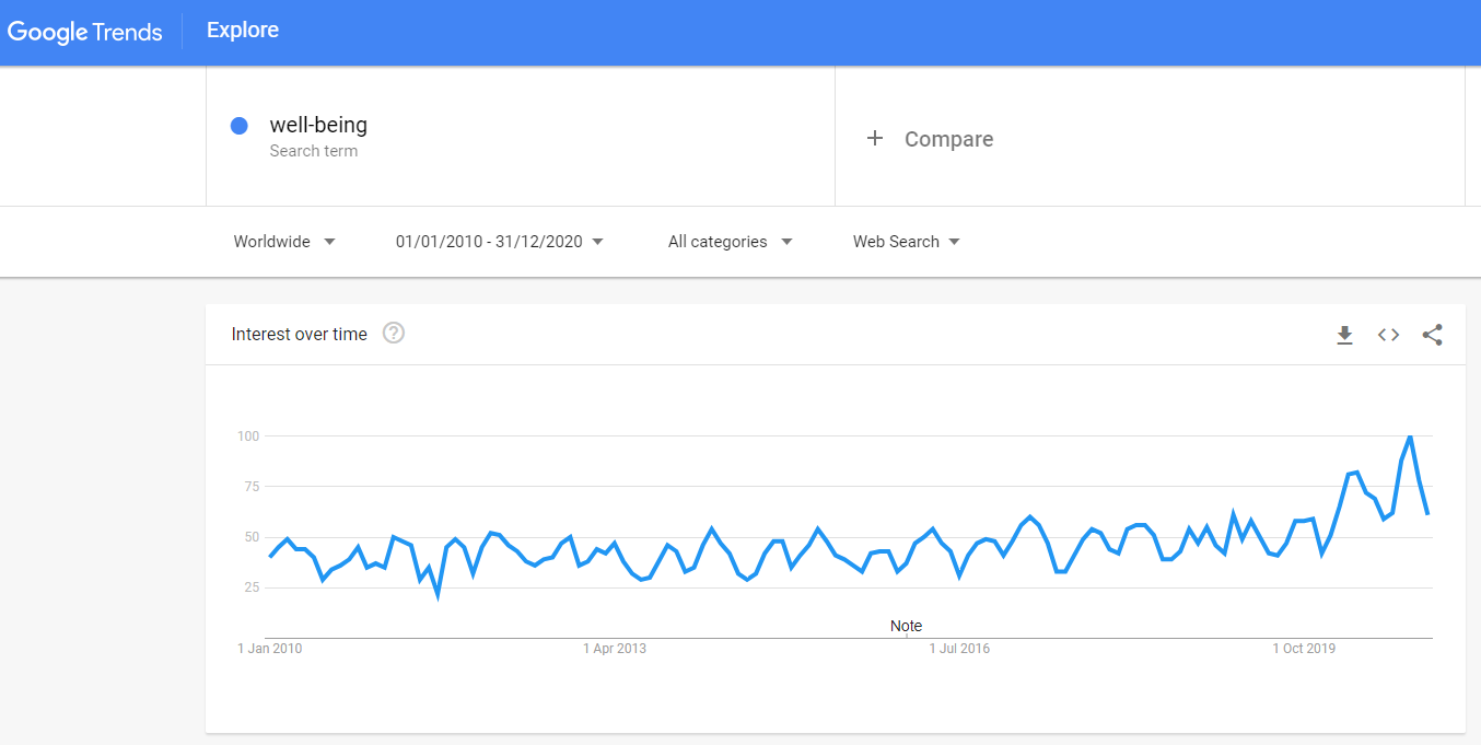 Fig. 2: Interest in “well-being” topic over the last 10 years measured as a search interest by Google Trends. The numbers represent search interest relative to the highest point on the chart for the given region and time. A value of 100 is the peak popularity for the term. A value of 50 means that the term is half as popular. A score of 0 means that there was not enough data for this term.
Based solely on the visual inspection of the graphs, it is pretty difficult to tell whether there was some effect of the COVID-19 pandemic or not, especially in the case of work-life balance (for the purpose of this analysis, the beginning of the pandemic is assumed to have started in March 2020). For sure it’s not a job for “inter-ocular trauma test” when the existence of the effect hits you directly between the eyes. We need to rely here on inferential statistics and its ability to help us with distinguishing signal from noise.
Before conducting the analysis itself, we need to wrangle the data from Google Trends a little bit using the recipe presented in the Wagner et. al (2002) paper. Specifically, we need the following five variables (or six, given that we have two dependent variables):
- search interest – a numerical variable representing search interest relative to the highest point on the chart for the given region and time; this variable is truncated within the interval between values of 0 and 100; a value of 100 is the peak popularity for the term; a value of 50 means that the term is half as popular; a score of 0 means that there was not enough data for this term; this variable serves as a dependent (criterion) variable;
- elapsed time – a numerical variable representing the number of months that elapsed from the beginning of the time series; this variable enables estimation of the size and direction of the overall trend in the data;
- pandemic – a binary variable indicating the presence/absence of pandemic; as already mentioned above, for the purpose of this analysis, the beginning of the pandemic is assumed to have started in March 2020; this variable enables estimation of the level change in the interest in work-life balance and well-being immediately after the pandemic outbreak;
- elapsed time after pandemic outbreak – a numerical variable representing the number of months that elapsed from the beginning of pandemic; this variable enables estimation of the change in the trend in the interest in work-life balance and well-being after the outbreak of pandemic;
- month – a categorical variable representing specific month within a year; this variable enables controlling for the effect of seasonality.
# uploading library for data manipulation
library(tidyverse)

# uploading data
dfWorkLifeBalance <- readr::read_csv("./workLifeBalanceGoogleTrendData.csv")
dfWellBeing <- readr::read_csv("./wellBeingGoogleTrendData.csv")

dfAll <- dfWorkLifeBalance %>%
  # joining both datasets
  dplyr::left_join(
    dfWellBeing, by = "Month"
    ) %>%
  # changing the format and name of Month variable
  dplyr::mutate(
    Month = stringr::str_glue("{Month}-01"),
    Month = lubridate::ymd(Month)
    ) %>%
  dplyr::rename(
    date = Month
    ) %>%
  # creating new variable month
  dplyr::mutate(
    month = lubridate::month(date,label = TRUE, abbr = TRUE),
    month = factor(month,
                   levels = c("Jan","Feb","Mar","Apr","May","Jun","Jul","Aug","Sep","Oct","Nov","Dec"),
                   labels = c("Jan","Feb","Mar","Apr","May", "Jun","Jul","Aug","Sep","Oct","Nov","Dec"),
                   ordered = FALSE)
    ) %>%
  # arranging data in ascending order by date
  dplyr::arrange(
    date
    ) %>%
  # creating new variables
  dplyr::mutate(
    elapsedTime = row_number(),
    pandemic = case_when(
      date >= "2020-03-01" ~ 1,
      TRUE ~ 0
      ),
    elapsedTimeAfterPandemic = cumsum(pandemic)
  ) %>%
  dplyr::mutate(
    pandemic = as.factor(case_when(
        pandemic == 1 ~ "After the pandemic outbreak",
        TRUE ~ "Before the pandemic outbreak"
        ))
  ) %>%
  # changing order of variables in df
  dplyr::select(
    date, workLifeBalance, wellBeing, elapsedTime, month, pandemic, elapsedTimeAfterPandemic
    )
Here is a table with the resulting data we will use for testing our hypothesis.
# uploading library for making user-friendly data table
library(DT)

DT::datatable(
  dfAll,
  class = 'cell-border stripe',
  filter = 'top',
  extensions = 'Buttons',
  fillContainer = FALSE,
  rownames= FALSE,
  options = list(
    pageLength = 5,
    autoWidth = TRUE,
    dom = 'Bfrtip',
    buttons = c('copy'),
    scrollX = TRUE,
    selection="multiple"
    )
  )
Table 1: Final dataset used for testing hypothesis about impact of the COVID-19 pandemic on people’s interest in work-life balance and well-being.
Bayesian segmented regression
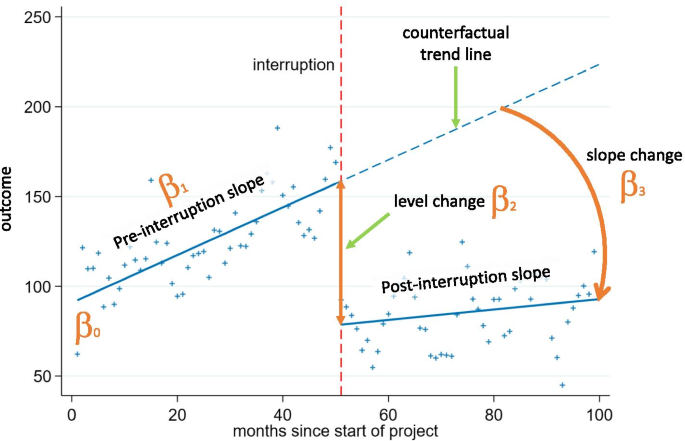
We will model our data using common segmented regression models that have following general structure:
The β0 coefficient estimates the baseline level of the outcome variable at time zero; β1 coefficient estimates the change in the mean of the outcome variable that occurs with each unit of time before the intervention (i.e. the baseline trend); β2 coefficient estimates the level change in the mean of the outcome variable immediately after the intervention (i.e. from the end of the preceding segment); and β3 estimates the change in the trend in the mean of the outcome variable per unit of time after the intervention, compared with the trend before the intervention (thus, the sum of β1 and β3 equals to the post-intervention slope). For a better understanding of the model, take a look at the illustrative chart below.
Since we are dealing with correlated and truncated data, we should also include two additional terms in our model, an autocorrelation term and a truncation term, to handle these specific properties of our data.
Now let’s fit the models to the data and check what they tell us about the effect of pandemic on people’s search interest in work-life balance and well-being. We will use brms r package that enables making inferences about statistical models’ parameters within Bayesian inferential framework. Because of that, we also need to specify some additional parameters (e.g. chains, iter or warmup) of the Markov Chain Monte Carlo (MCMC) algorithm that will generate posterior samples of our models’ parameters.
Bayesian framework also enables us to specify priors for estimated parameter and through them include our domain knowledge in the analysis. The specified priors are important for both parameter estimation and hypothesis testing as they define our starting information state before we take into account our data. Here we will use rather wide, uninformative, and only mildly regularizing priors (it means that the results of the inference will be very close to the results of standard, frequentist parameter estimation/hypothesis testing).
# uploading library for Bayesian statistical inference
library(brms)

# checking available priors for the models
brms::get_prior(
  workLifeBalance | trunc(lb = 0, ub = 100) ~ elapsedTime + pandemic + elapsedTimeAfterPandemic + month + ar(p = 1),
  data = dfAll,
  family = gaussian())

brms::get_prior(
  wellBeing | trunc(lb = 0, ub = 100) ~ elapsedTime + pandemic + elapsedTimeAfterPandemic + month + ar(p = 1),
  data = dfAll,
  family = gaussian())
# uploading library for Bayesian statistical inference
library(brms)

# specifying wide, uninformative, and only mildly regularizing priors for predictors in both models
priors <- c(set_prior("normal(0,50)", class = "b", coef = "elapsedTime"),
            set_prior("normal(0,50)", class = "b", coef = "elapsedTimeAfterPandemic"),
            set_prior("normal(0,50)", class = "b", coef = "pandemicBeforethepandemicoutbreak"),
            set_prior("normal(0,50)", class = "b", coef = "monthApr"),
            set_prior("normal(0,50)", class = "b", coef = "monthAug"),
            set_prior("normal(0,50)", class = "b", coef = "monthDec"),
            set_prior("normal(0,50)", class = "b", coef = "monthFeb"),
            set_prior("normal(0,50)", class = "b", coef = "monthJul"),
            set_prior("normal(0,50)", class = "b", coef = "monthJun"),
            set_prior("normal(0,50)", class = "b", coef = "monthMar"),
            set_prior("normal(0,50)", class = "b", coef = "monthMay"),
            set_prior("normal(0,50)", class = "b", coef = "monthNov"),
            set_prior("normal(0,50)", class = "b", coef = "monthOct"),
            set_prior("normal(0,50)", class = "b", coef = "monthSep"))

# defining the statistical model for work-life balance
modelWorkLifeBalance <- brms::brm(
  workLifeBalance | trunc(lb = 0, ub = 100) ~ elapsedTime + pandemic + elapsedTimeAfterPandemic + month + ar(p = 1),
  data = dfAll,
  family = gaussian(),
  prior = priors,
  chains = 4,
  iter = 3000,
  warmup = 1000,
  seed = 12345,
  sample_prior = TRUE
  )

# defining the statistical model for well-being
modelWellBeing <- brms::brm(
  wellBeing | trunc(lb = 0, ub = 100) ~ elapsedTime + pandemic + elapsedTimeAfterPandemic + month + ar(p = 1),
  data = dfAll,
  family = gaussian(),
  prior = priors,
  chains = 4,
  iter = 3000,
  warmup = 1000,
  seed = 678910,
  sample_prior = TRUE
  )
Some necessary sanity checks
Before making any inferences, we should make some sanity checks to be sure that the mechanics of the MCMC algorithm worked well and that we can use generated posterior samples for making inferences about our models’ parameters. There are many ways for doing that, but here we will use only visual check of the MCMC chains. We want plots of these chains look like hairy caterpillar which would indicate convergence of the underlying Markov chain to stationarity and convergence of Monte Carlo estimators to population quantities, respectively. As can be seen in Graph 1 and 2 below, in case of both models we can observe wanted characteristics of the MCMC chains described above. (For additional MCMC diagnostics procedures, see for example Bayesian Notes from Jeffrey B. Arnold.)
# uploading library for plotting Bayesian models
library(bayesplot)

# plotting the MCMC chains for the modelWorkLifeBalance
bayesplot::mcmc_trace(
  modelWorkLifeBalance,
  facet_args = list(nrow = 6)
  ) +
  ggplot2::labs(
    title = "Plots of the MCMC chains used for estimation of the modelWorkLifeBalance's parameters"
    )
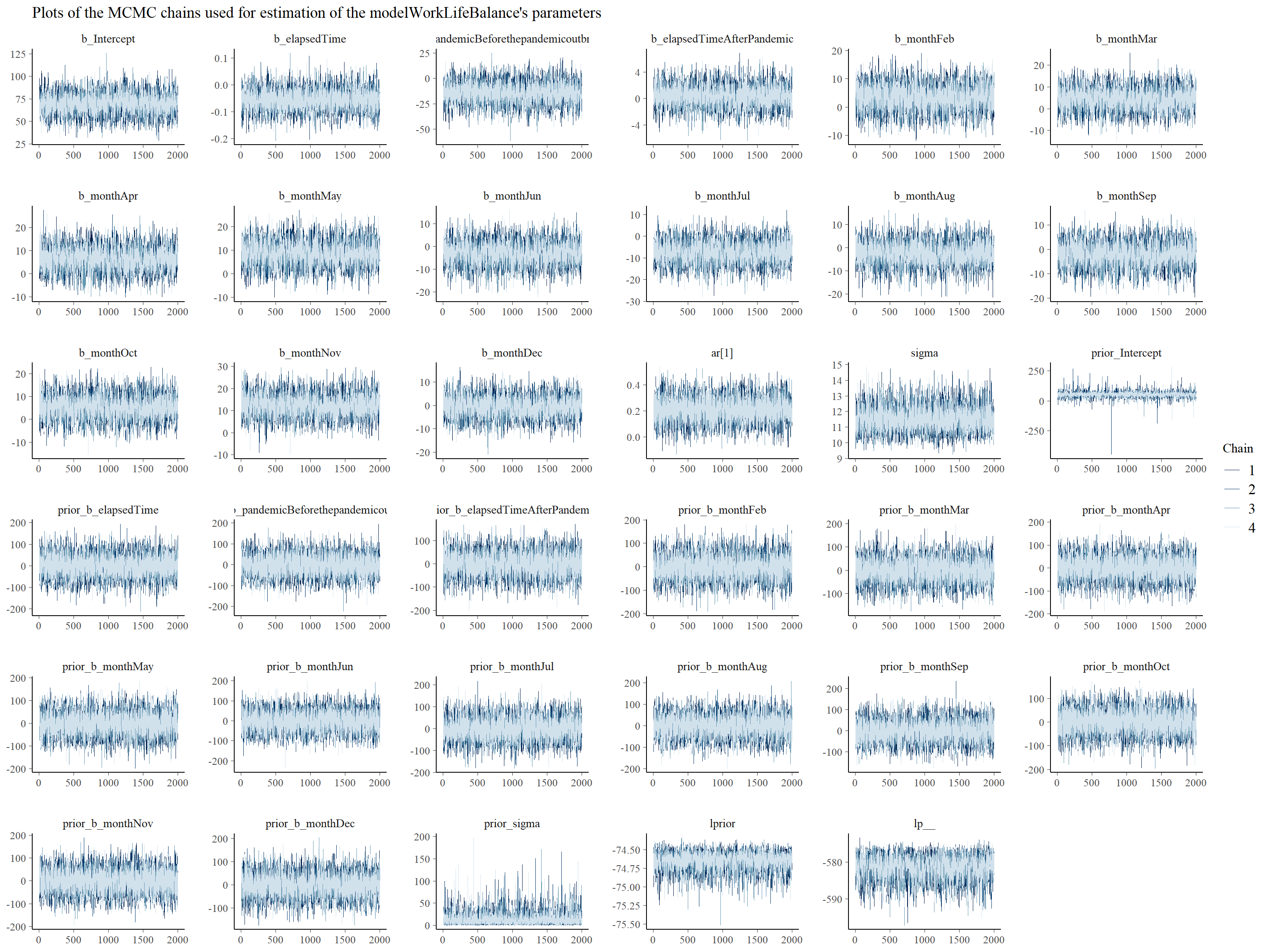
Graph 1: Trace plots of Markov chains for individual parameters of the modelWorkLifeBalance.
# plotting the MCMC chains for the modelWellBeing
bayesplot::mcmc_trace(
  modelWellBeing,
  facet_args = list(nrow = 6)
  ) +
  ggplot2::labs(
    title = "Plots of the MCMC chains used for estimation of the modelWellBeing's parameters"
    )
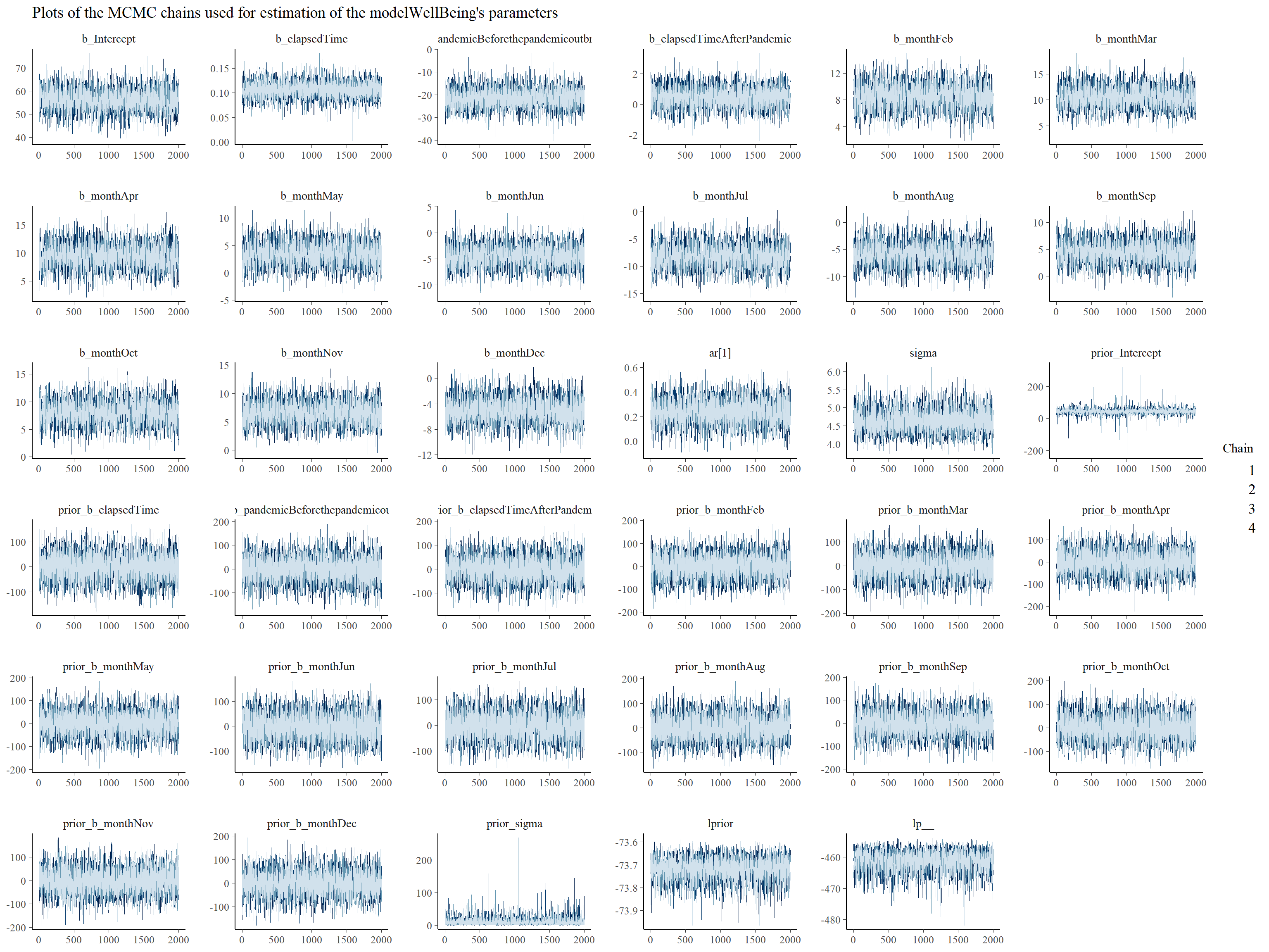 Graph 2: Trace plots of Markov chains for individual parameters of the modelWellBeing.
It is also important to check how well the models fit the data. We can use for this purpose posterior predictive checks that use specified number of sampled posterior values of models’ parameters and show how well the fitted models predict observed data. We can see in Graphs 3 and 4 that both models fit the observed data reasonably well.
# investigating modelWorkLifeBalance fit

# specifying the number of samples
nsamples = 1000

brms::pp_check(
  modelWorkLifeBalance,
  nsamples = nsamples
  ) +
  ggplot2::labs(
    title = stringr::str_glue("Posterior predictive checks for modelWorkLifeBalance (using {nsamples} samples)")
    )
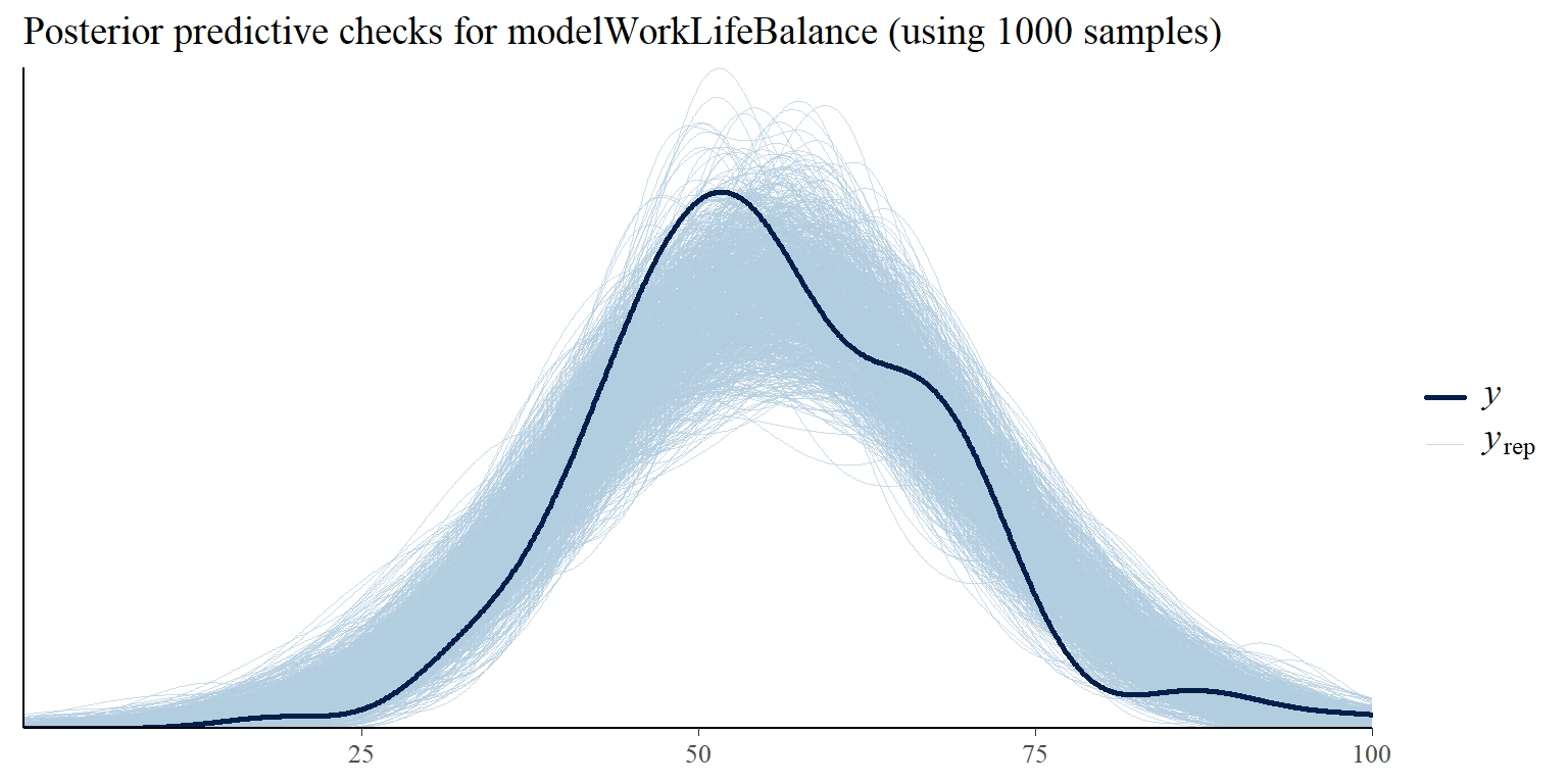
Graph 3: Posterior predictive checks comparing simulated/replicated data under the fitted modelWorkLifeBalance with the observed data.
# investigating modelWellBeing fit

# specifying the number of samples
nsamples = 1000

brms::pp_check(
  modelWellBeing,
  nsamples = nsamples
  ) +
  ggplot2::labs(
    title = stringr::str_glue("Posterior predictive checks for modelWellBeing (using {nsamples} samples)")
    )
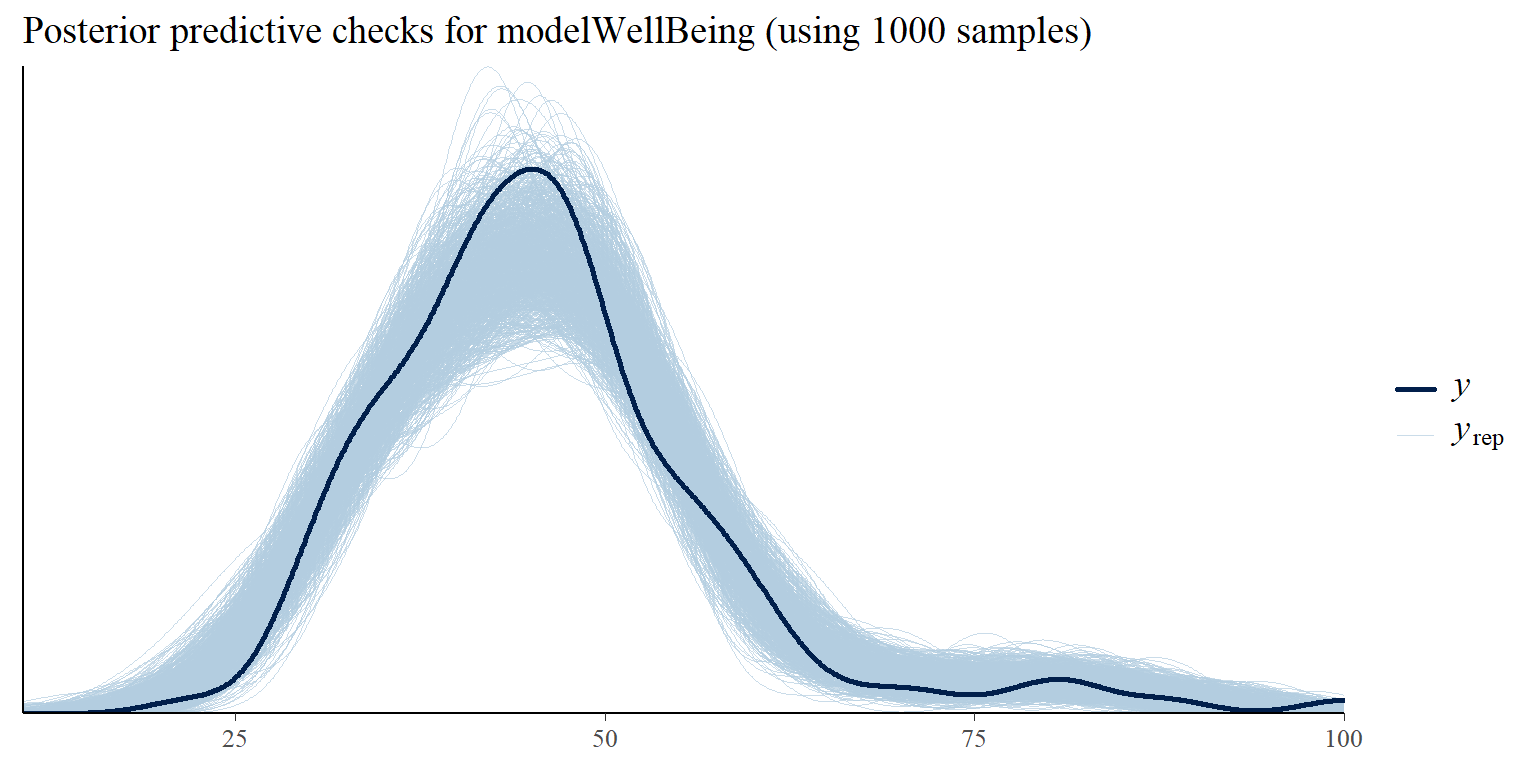
Graph 4: Posterior predictive checks comparing simulated/replicated data under the fitted modelWellBeing with the observed data.
Results of the analysis
Now, after having sufficient confidence that - using terminology from the Richard McElreath’s book Statistical Rethinking - our “small worlds” can pretty accurately mimic the data coming from our real,“big world”, we can use our models’ parameters to learn something about our research questions. Our primary interest is in the coefficient value of the pandemicBeforethepandemicoutbreak and elapsedTimeAfterPandemic terms in our models. It expresses how much and in what direction people’s search interest in work-life balance and well-being changed immediately after the outbreak of pandemic, and how slope of the trend changed after the pandemic, respectively.
In Graph 5 and 6 we can see posterior distribution of the pandemicBeforethepandemicoutbreak parameter in our two models. In both cases the posterior distribution of the pandemic term is (predominantly or completely) on the left side of the zero value, which supports the claim about existence of the effect of pandemic on people’s increased search interest in work-life balance and well-being immediately after the outbreak of pandemic. As is apparent from the graphs, for well-being (Graph 6) this evidence is much stronger than for work-life balance (Graph 5), which corresponds to impression we might have when looking at the original Google Trends charts shown in Fig. 1 and 2.
# uploading library for
library(tidybayes)

# visualizing posterior distribution of the pandemicBeforethepandemicoutbreak parameter in the modelWorkLifeBalance
modelWorkLifeBalance %>%
  tidybayes::gather_draws(
    b_pandemicBeforethepandemicoutbreak
    ) %>%
  dplyr::mutate(
    .variable = factor(
      .variable,
      levels = c("b_pandemicBeforethepandemicoutbreak"),
      ordered = TRUE
      )
    ) %>%
  dplyr::rename(value = .value) %>%
  ggplot2::ggplot(
    aes(x = value)
    ) +
  ggplot2::geom_density(
    fill = "lightblue"
  ) +
  ggplot2::labs(
    title = "Posterior distribution of the pandemicBeforethepandemicoutbreak parameter\nin the modelWorkLifeBalance"
    )
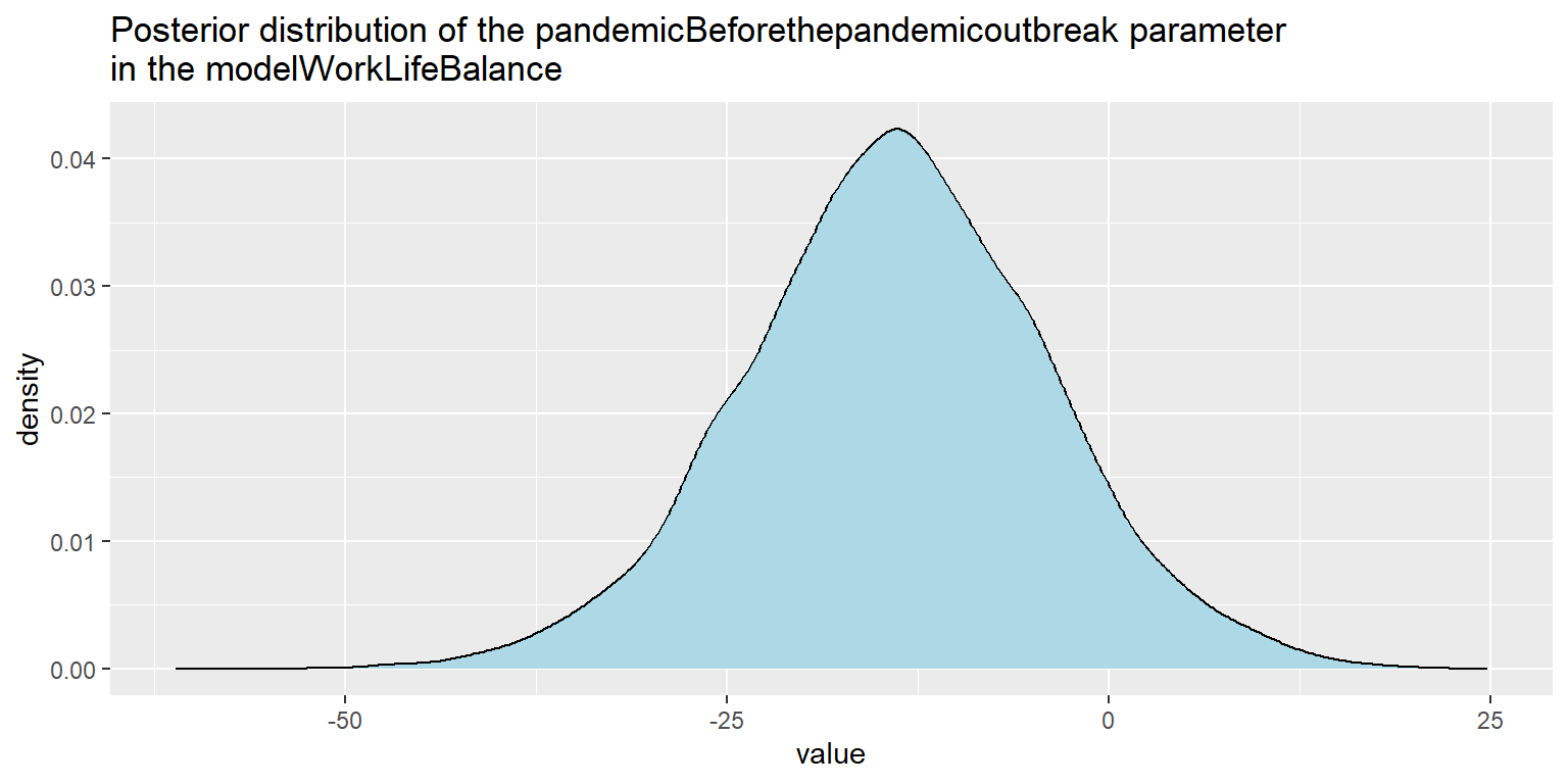
Graph 5: Visualization of the posterior distribution of the pandemicBeforethepandemicoutbreak parameter in the modelWorkLifeBalance.
# visualizing posterior distribution of the pandemicBeforethepandemicoutbreak parameter in the modelWellBeing
modelWellBeing %>%
  tidybayes::gather_draws(
    b_pandemicBeforethepandemicoutbreak
    ) %>%
  dplyr::mutate(
    .variable = factor(
      .variable,
      levels = c("b_pandemicBeforethepandemicoutbreak"),
      ordered = TRUE
      )
    ) %>%
  dplyr::rename(value = .value) %>%
  ggplot2::ggplot(
    aes(x = value)
    ) +
  ggplot2::geom_density(
    fill = "lightblue"
  ) +
  ggplot2::labs(
    title = "Posterior distribution of the pandemicBeforethepandemicoutbreak parameter\nin the modelWellBeing"
    )
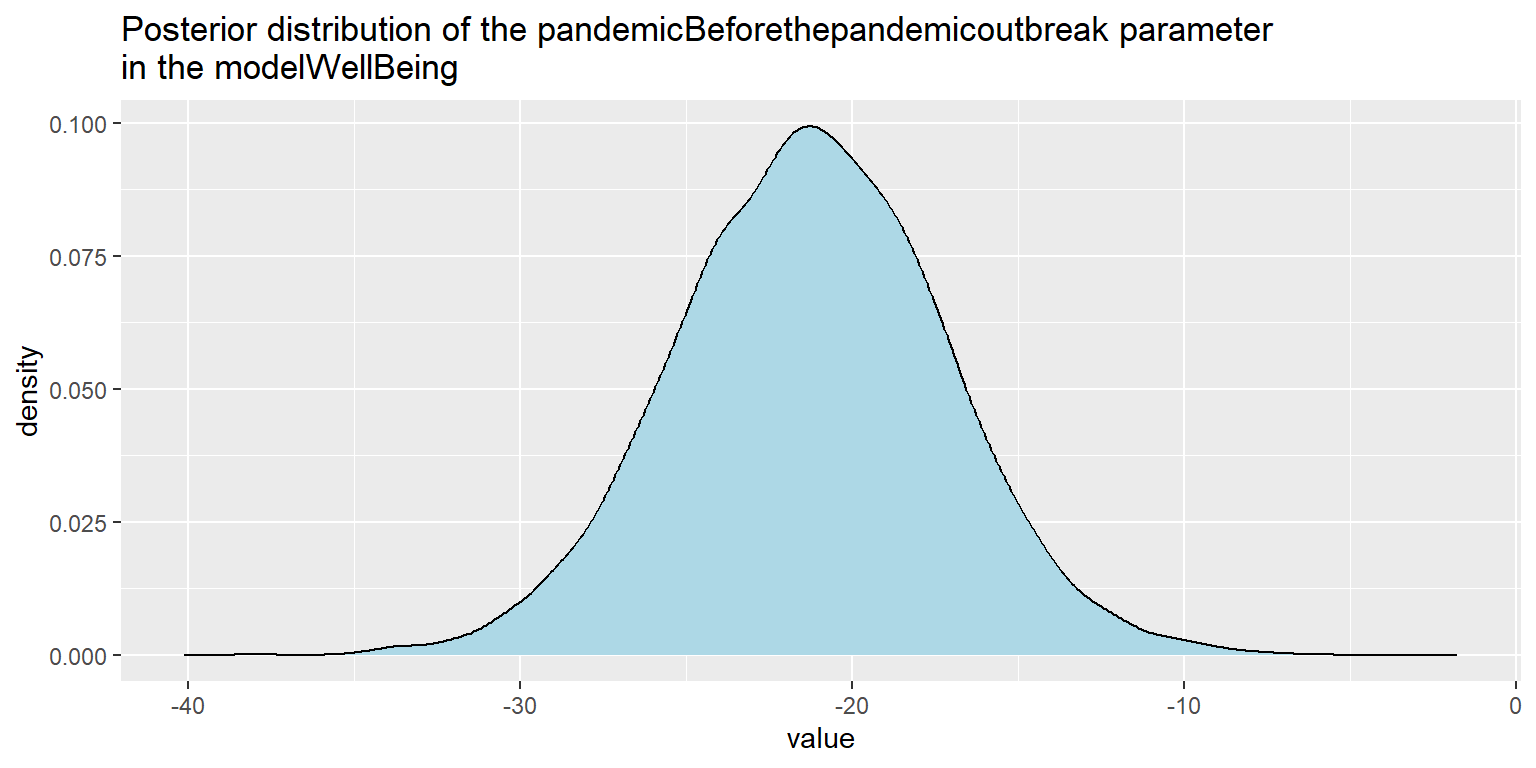
Graph 6: Visualization of the posterior distribution of the pandemicBeforethepandemicoutbreak parameter in the modelWellBeing.
To generate more summary statistics about posterior distributions (and also some diagnostic information like Rhat or ESS), we can use summary() function.
# generating a summary of the results for modelWorkLifeBalance
summary(modelWorkLifeBalance)
# generating a summary of the results for modelWellBeing
summary(modelWellBeing)
Given that for work-life balance model the posterior distribution of pandemic term crosses the zero value, it would be useful to know how strong is the evidence in the favor of hypothesis that pandemic term is lower than zero. For that purpose we can extract posterior samples and use them for calculation of the proportion of values that are larger/smaller than zero. The resulting proportions show that the vast majority (around 92%) of posterior distribution lies below zero.
# extracting posterior samples
samples <- brms::posterior_samples(modelWorkLifeBalance, seed = 12345)

# probability of b_pandemicBeforethepandemicoutbreak coefficient being lower than 0
sum(samples$b_pandemicBeforethepandemicoutbreak < 0) / nrow(samples)
Now let’s check the parameter elapsedTimeAfterPandemic. Its posterior distribution in both models “safely” includes zero value, which indicates that there is not huge support for positive change in trend after the outbreak of pandemic.
# visualizing posterior distribution of the elapsedTimeAfterPandemic parameter in the modelWorkLifeBalance
modelWorkLifeBalance %>%
  tidybayes::gather_draws(
    b_elapsedTimeAfterPandemic
    ) %>%
  dplyr::mutate(
    .variable = factor(
      .variable,
      levels = c("b_elapsedTimeAfterPandemic"),
      ordered = TRUE
      )
    ) %>%
  dplyr::rename(value = .value) %>%
  ggplot2::ggplot(
    aes(x = value)
    ) +
  ggplot2::geom_density(
    fill = "lightblue"
  ) +
  ggplot2::labs(
    title = "Posterior distribution of the elapsedTimeAfterPandemic parameter\nin the modelWorkLifeBalance"
    )
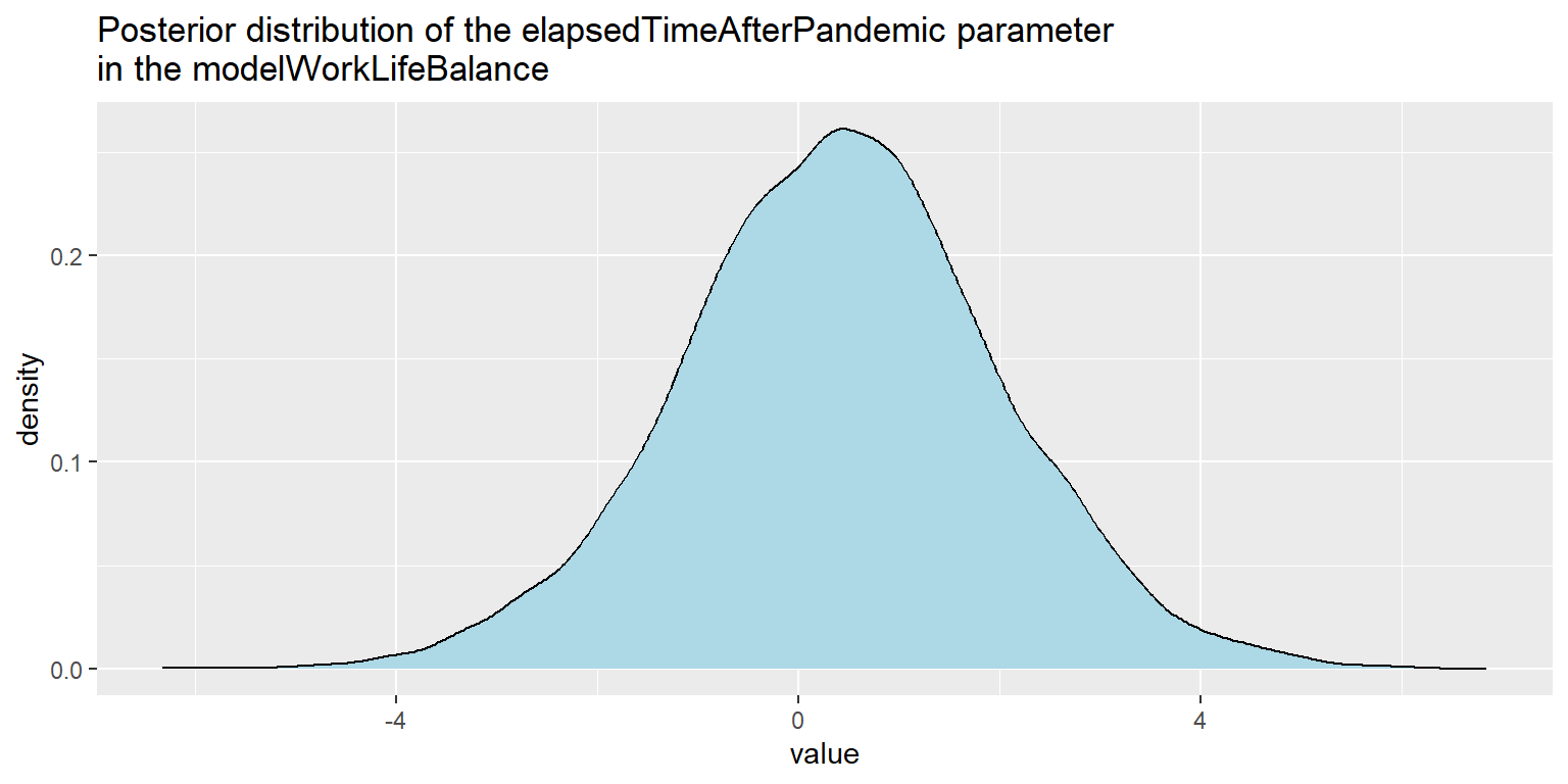
Graph 7: Visualization of the posterior distribution of the elapsedTimeAfterPandemic parameter in the modelWorkLifeBalance.
# visualizing posterior distribution of the elapsedTimeAfterPandemic parameter in the modelWellBeing
modelWellBeing %>%
  tidybayes::gather_draws(
    b_elapsedTimeAfterPandemic
    ) %>%
  dplyr::mutate(
    .variable = factor(
      .variable,
      levels = c("b_elapsedTimeAfterPandemic"),
      ordered = TRUE
      )
    ) %>%
  dplyr::rename(value = .value) %>%
  ggplot2::ggplot(
    aes(x = value)
    ) +
  ggplot2::geom_density(
    fill = "lightblue"
  ) +
  ggplot2::labs(
    title = "Posterior distribution of the elapsedTimeAfterPandemic parameter\nin the modelWellBeing"
    )
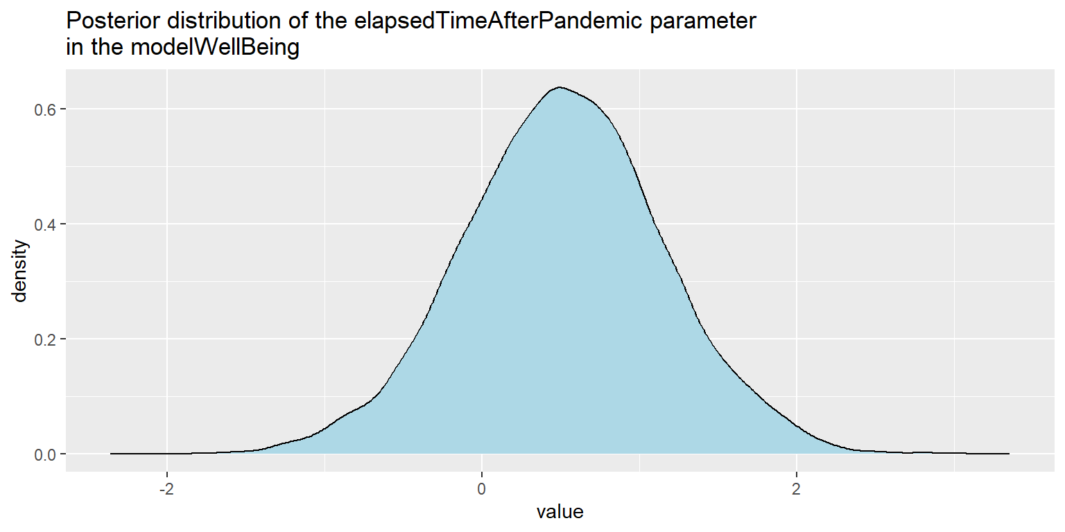
Graph 8: Visualization of the posterior distribution of the elapsedTimeAfterPandemic parameter in the modelWellBeing.
In conclusion, we can say that there is some evidence that the COVID-19 pandemic has prompted people to be more interested in topics related to work-life balance and well-being. I wish us all to be able to transform our increased interest in these topics into truly increased quality of our personal and professional lives. It would be a shame not to use that extra incentive many of us have now for making significant change in our lives.
Related notes
- The impact of the COVID pandemic on the popularity of people analytics
- Did the Nobel Prize put causal inference on the public radar?
- RWA – A go-to tool for key drivers analysis of employee survey data?
- Visual statistical inference
- Psychometric network analysis & employee survey data
📄 Read the original post with full outputs on my blog.