I recently listened to a podcast about a very interesting study about conspiracies and disinformation in Czech society, and one of the authors of the study, Matous Pilnacek, a sociologist, spoke very enthusiastically and positively during the interview about the analytical possibilities offered by Latent Class Analysis (LCA).
Not being a sociologist, among whom this tool is well-known, I was quite easily impressed and hooked 🙂 LCA allows probabilistic modeling of multivariate categorical data with the assumption that there are latent classes of people who are characterized by a common pattern of probabilities of responses to a set of questions on some categorical, e.g. Likert scale.
LCA is thus a natural fit for identifying subgroups of people with similar work views. Compared to other methods used in this context, such as Factor Analysis, k-means, or hierarchical clustering, it has several advantages:
- LCA can handle well categorical observed variables.
- LCA estimates probabilities of class membership, so it inherently incorporates uncertainty about which class each individual belongs to.
- LCA allows for meaningful analysis of missing answers or non-answers together with proper answers on a Likert scale.
- LCA provides a framework (via information criteria like BIC, AIC, or likelihood ratio tests) for comparing models with different numbers of classes.
- LCA’s output is intuitive and easy to interpret.
What follows, is a a small demonstration of this tool on artificial employee survey data accompanying the book Predictive HR Analytics: Mastering the HR Metric by Edwards & Edwards (2019). It contains the survey responses of 832 employees on a 1 ‘strongly disagree’ to 5 ‘strongly agree’ response scale for a following set of statements.
# uploading libraries
library(readxl)
library(DT)
library(tidyverse)

# uploading legend to the data
legend <- readxl::read_excel("./surveyResults.xls", sheet = "Legend")

# user-friendly table with individual survey items
DT::datatable(
  legend %>% dplyr::mutate(Scale = as.factor(Scale)),
  class = 'cell-border stripe',
  filter = 'top',
  extensions = 'Buttons',
  fillContainer = FALSE,
  rownames= FALSE,
  options = list(
    pageLength = 5,
    autoWidth = TRUE,
    dom = 'Bfrtip',
    buttons = c('copy'),
    scrollX = TRUE,
    selection="multiple"
  )
)
Before moving on to modeling, we first need to wrangle the data a bit - select the relevant variables, change their data type, and replace missing values with “Prefer Not to Say” reply category.
# uploading data
data <- readxl::read_excel("./surveyResults.xls", sheet = "Data")

# preparing the data for modeling
mydata <- data %>%
  dplyr::select(-sex:-ethnicity) %>%
  dplyr::mutate_all(as.character) %>%
  replace(is.na(.), "Prefer Not to Say") %>%
  dplyr::mutate_all(factor, levels = c("1", "2", "3", "4", "5", "Prefer Not to Say"))
Now we can proceed with the modeling. For this we will use poLCA R package. One of the parameters to be set is the expected number of classes. To choose the right number, we need to fit several LCA models with different numbers of classes and, based on information criteria such as BIC or AIC, choose the model with the best balance between model complexity and good fit to the data. Here, I set the parameter to the best value I determined earlier.
# uploading library
library(poLCA)

# specifying and running the model
set.seed(1234)
lca_model <- poLCA::poLCA(
  cbind(ManMot1, ManMot2, ManMot3, ManMot4, ocb1, ocb2, ocb3, ocb4, aut1, aut2, aut3, Justice1, Justice2, Justice3, JobSat1, JobSat2, Quit1, Quit2, Quit3, Man1, Man2, Man3, Eng1, Eng2, Eng3, Eng4, pos1, pos2, pos3)~1,
  data = mydata,
  nclass = 4,
  nrep = 3,
  verbose = FALSE,
  graphs = FALSE
)
Let’s check some of the outputs of the analysis: 1) probability of responses to individual items by people from different classes,
# looking at the model output
lca_model
- probabilities of people belonging to individual classes,
# probabilities of belonging to individual classes (first 10 rows)
head(lca_model$posterior, n = 10)
and 3) predicted belongings of people to the classes.
# predicted belongings to the classes
lca_model$predclass

# checking the size of the classes
table(lca_model$predclass)
If we wanted to visualize the results using our own charts, for example, with full-stacked bar charts showing average probability of responses per scale and class, we need to do some data wrangling of information extracted from the fitted model.
# extracting information from the model for dataviz
scaleNames <- mydata %>% names()
classes <- 4
responsesDf <- data.frame()

for(s in scaleNames){

  df <- data.frame()

  counter <- 1

  for(v in 1:length(lca_model$probs[[s]])){

    p <- lca_model$probs[[s]][v]
    cl <- paste0("Class ", counter)

    supp <- data.frame(item = s, class = cl, p = p)

    df <- rbind(df, supp)

    if(counter < classes){

      counter <- counter + 1

    } else{

      counter <- 1

    }

  }

  df <- df %>%
    dplyr::mutate(choice = rep(c("Strongly Disagree","Disagree","Neither Agree nor Disagree","Agree","Strongly Agree","Prefer Not to Say"), each=classes))

  responsesDf <- rbind(responsesDf, df)

}

# computing size of individual classes
classCnts <- table(lca_model$predclass) %>%
  as.data.frame() %>%
  dplyr::mutate(
    Var1 = as.character(Var1),
    Var1 =  paste0("Class ", Var1)
  ) %>%
  dplyr::rename(
    class = Var1,
    freq = Freq
    )

# final df for dataviz
datavizDf <- responsesDf %>%
  dplyr::mutate(
    scale = stringr::str_remove_all(item, "\\d"),
    choice = factor(choice, levels = c("Strongly Disagree","Disagree","Neither Agree nor Disagree","Agree","Strongly Agree","Prefer Not to Say"), ordered = TRUE),
    scale = case_when(
      scale == "aut" ~ "Autonomy",
      scale == "Eng" ~ "Engagement",
      scale == "JobSat" ~ "Job Satisfaction",
      scale == "Justice" ~ "Proc.Justice",
      scale == "Man" ~ "Management",
      scale == "ManMot" ~ "Mng.Motivation",
      scale == "ocb" ~ "OCB",
      scale == "pos" ~ "Org.Support",
      scale == "Quit" ~ "Quitting Intentions"
    )
    ) %>%
  dplyr::group_by(scale, class, choice) %>%
  dplyr::summarise(p = mean(p)) %>%
  dplyr::ungroup() %>%
  dplyr::left_join(classCnts, by = "class") %>%
  dplyr::mutate(class = stringr::str_glue("{class} (n = {freq})"))
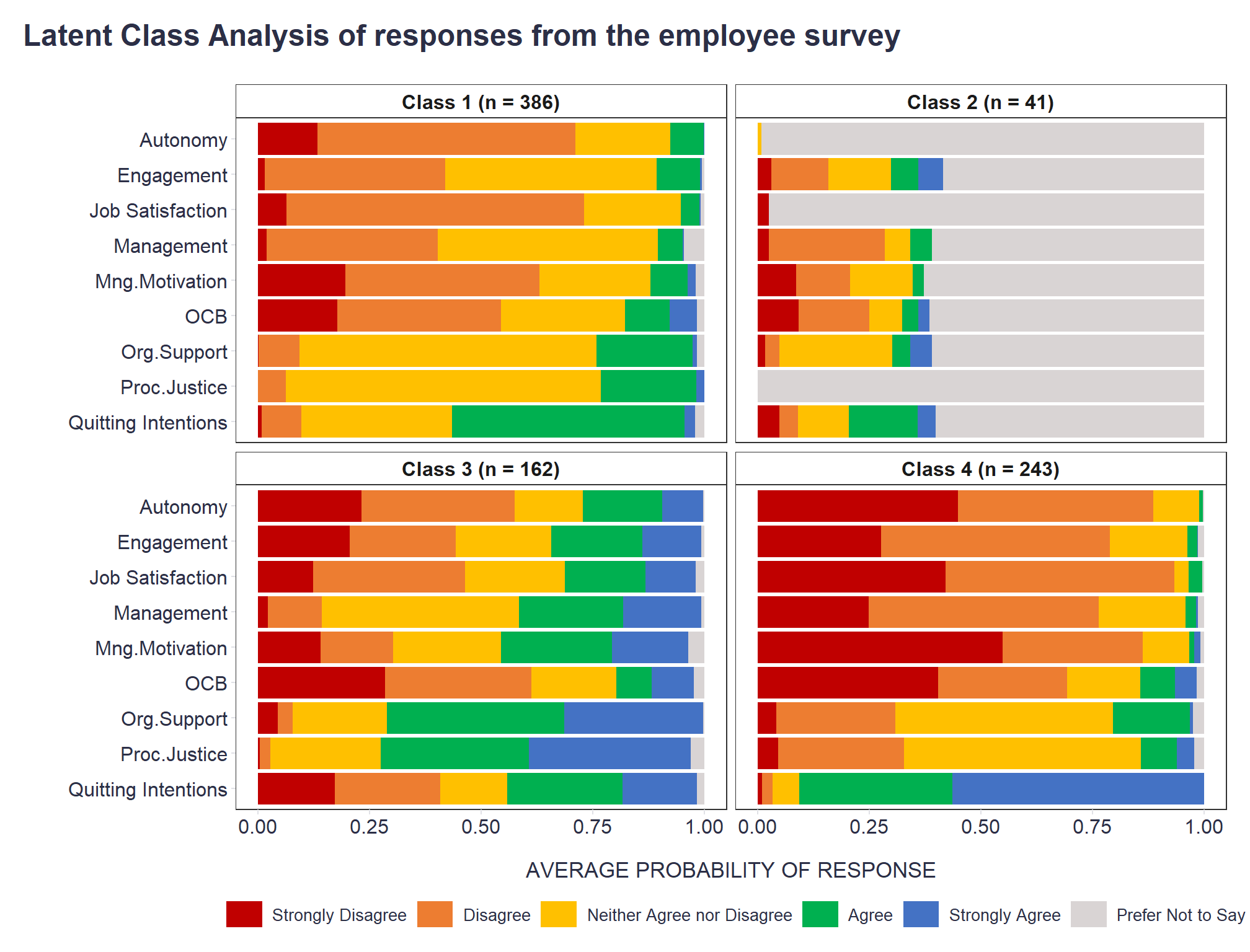
In the resulting graphs, we quickly see that there is one class of people who often prefer not to give their opinion in an employee survey (Class 2), one class of people with a strongly negative view of their employment experience (Class 4), one class of people with a neutral to slightly negative view of work (Class 1), and one class of people with a neutral to positive view of work (Class 3).
# dataviz
datavizDf %>%
  ggplot2::ggplot(aes(x = scale, y = p, fill = choice)) +
  ggplot2::scale_x_discrete(limits = rev) +
  ggplot2::geom_bar(stat = "identity", position = position_fill(reverse = TRUE)) +
  ggplot2::scale_fill_manual(values = c("Strongly Disagree"="#c00000","Disagree"="#ed7d31","Neither Agree nor Disagree"="#ffc000","Agree"="#00b050","Strongly Agree"="#4472c4","Prefer Not to Say"="#d9d4d4")) +
  ggplot2::coord_flip() +
  ggplot2::facet_wrap(~class,nrow = 2) +
  ggplot2::labs(
    x = "",
    y = "AVERAGE PROBABILITY OF RESPONSE",
    fill = "",
    title = "Latent Class Analysis of responses from the employee survey"
    ) +
  ggplot2::theme_bw() +
  ggplot2::theme(
    plot.title = element_text(color = '#2C2F46', face = "bold", size = 18, margin=margin(0,0,20,0)),
    plot.subtitle = element_text(color = '#2C2F46', face = "plain", size = 15, margin=margin(0,0,20,0)),
    plot.caption = element_text(color = '#2C2F46', face = "plain", size = 11, hjust = 0),
    axis.title.x.bottom = element_text(margin = margin(t = 15, r = 0, b = 0, l = 0), color = '#2C2F46', face = "plain", size = 13),
    axis.title.y.left = element_text(margin = margin(t = 0, r = 15, b = 0, l = 0), color = '#2C2F46', face = "plain", size = 13),
    axis.text = element_text(color = '#2C2F46', face = "plain", size = 12, lineheight = 16),
    strip.text = element_text(size = 12, face = "bold"),
    strip.background = element_rect(fill = "white"),
    axis.ticks = element_line(color = "#E0E1E6"),
    legend.position= "bottom",
    legend.key = element_rect(fill = "white"),
    legend.key.width = unit(1.6, "line"),
    legend.margin = margin(0,0,0,0, unit="cm"),
    legend.text = element_text(color = '#2C2F46', face = "plain", size = 10, lineheight = 16),
    legend.box.margin=margin(0,0,0,0),
    panel.background = element_blank(),
    panel.grid.major.y = element_blank(),
    panel.grid.major.x = element_blank(),
    panel.grid.minor = element_blank(),
    plot.margin=unit(c(5,5,5,5),"mm"),
    plot.title.position = "plot",
    plot.caption.position =  "plot",
  ) +
  ggplot2::guides(fill = guide_legend(nrow = 1))
It would certainly be possible to delve deeper into the results, but for a basic overview of the process of LCA and its outputs, this might be sufficient. If interested, a more detailed introduction to LCA can be found, for example, in this practitioner’s guide.
Related notes
- RWA – A go-to tool for key drivers analysis of employee survey data?
- Psychometric network analysis & employee survey data
- Personas based on ML local interpretation algorithms
- Using network graph modeling to capture overarching thematic clusters in employee comments
- Multilevel modeling in people analytics
📄 Read the original post with full outputs on my blog.